How to decorate the house taking advantage of the benefits of colors?
As the months passed, the pandemic has brought a number of impacts. That, of course, you already know.
Just as it was necessary to adapt the activities at work, changes in the personal area became fundamental.
Among them, decorating the house became an alternative to leave the environments with renewed energy.
Changing colors when decorating the house is good for health
When it comes to decoration, changing colors in environments is a habit that can generate positive returns in our day.
This fact is shown in a survey conducted by AkzoNobel, owner of the Coral brand.
In the material, the records show that 73% of Brazilian respondents agree that changing colors when decorating the house contributes to improve the quality of life.
Also according to the study, 71% think that decorating the house is a way to start over after experiencing some bad experience.
Did you hit the urge to change the colors of the walls? In today’s post, we show you the right color to be applied in the main rooms of the house and what sensations they convey.
Types of colors to renovate walls
Blue
It conveys the feeling of calm and relaxation. Therefore, the tint is recommended for application in bathrooms, living room and bedrooms.
On the other hand, blue also increases productivity and attracts wisdom, being an alternative to decorate the walls of offices and study rooms.

Yellow
This gentle nuance is completely energizing, as well as can provoke stimuli for those looking for an environment full of comfort and warmth. Yellow is indicated for living areas and living rooms.
In addition, the color is a great option to highlight the details of the place that will have the décor renewed.

White
To the fans of the minimalist style, white is the basis for an environment with visual amplitude and full of tranquility.
Recommended for kitchens and hallways, the tint is also complementary to other colors and can be easily applied in more than one place in the house.

Green
Remember nature, be closer to the positive energies it transmits. To use green is usually to be aware of the trends presented in lectures and design fairs.
The portfolio offered by this color fulfills a sensational role indoors, revealing places of peace and quiet.

Gray
Who has never heard of the new black in the décor? Here, a curiosity: if the goal is to convey sensations, color works as a neutralizer.
Discreet and sober, using gray is dispensing with the strongest emotions. When decorating the house, color is an alternative to make your living room even more elegant.

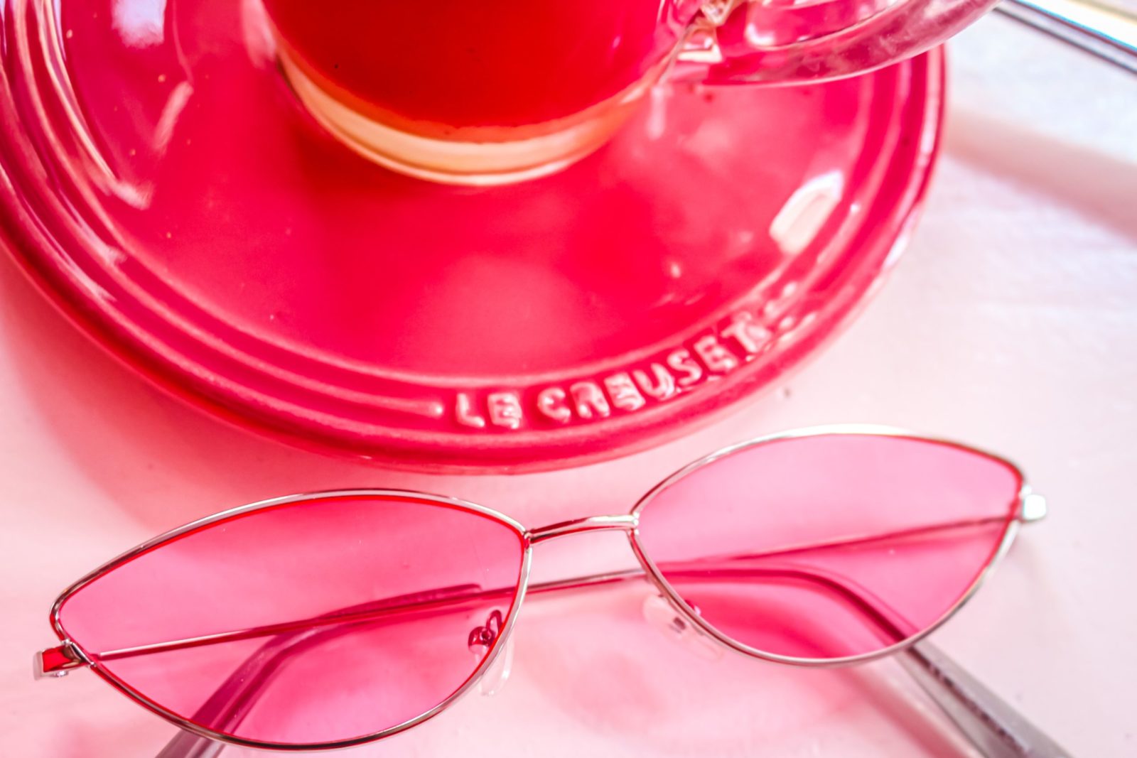
Red
When it comes to emotions and stimuli, red is part of the family of more dramatic tones, being often associated with feelings such as passion, emotion and energy.
Do you love that color?
Know that it can be a productive choice for home offices and creative spaces, so much so that red is the option to channel a rich and traditional aesthetic or even a pop-art sensation.

Black
Suitable for modern and industrial environments. As in a wardrobe, black results in elegant interiors, ready to be highlighted with another complementary tone.

Other tips for decorating using colors
Neutral tones
At first glance, the neutral tones also generate greater amplitude when decorating the house and make the rooms clearer.
The tendency is to be used as a base, in furniture, floors, walls or other decorative details.
Chromatic circle
This table gathers all colors, such as those classified as primary (yellow, blue and red), secondary (orange, violet and green) and tertiary (six shades obtained by mixing the secondary).
Just as colors can be used in a one-way way, the circle allows for two types of combinations: complementary or analogous.
Complementary combinations
They are those that are in opposite places in the chromatic circle and, consequently, have a lot of contrast.
To avoid mistakes, one suggestion is to choose one predominant and leave the other with less evidence.
Let’s exemplify: the complementary color of green is red, the complementary color of violet is yellow, and so on.
In a light: choose tones that converse with each other. Have you ever thought of an amazing orange décor with shades of blue or purple? You can.
Analog combinations
In this case, the analog tones are close. When decorating the house, colors create decorations with visual unity. Reminder: In order to avoid overloading, neutral tones may contrast, as they do not offer contrast.
Were you inspired by the tips?
Time to get started!
Do you like decorating the house?
So one thing is certain: colors interfere with the design. Therefore, the importance of choosing the right tones, depending on each location that will be decorated.
Allied when it comes to revitalizing a room, the colors say a lot. Over the years, many have realized this importance, creating theories that promise mastery over colors and what results can be achieved through the use of them.
One example is in the famous work “The theory of colors”, written by Johann W. Von Goethe, in addition to the precepts of Feng Shui.
Get out of the basics and create innovative environments when decorating the house
It is allowed to dare when decorating the house and, when necessary, seek the support of a specialized professional. Don’t forget to calculate the energy of the tones and evaluate the architecture and design of the space.
If, when decorating the house, you want a space that is also a place of good sensations, pull in memory which tones please you the most.
Investing in colors in decoration is a way to make the home more inviting for all who attend it. We hope today’s tips motivate you to something more colorful and stylish.
So, what color will be chosen?


